

|
| May 2000 Issue |
Get some perspective |
|
In the last couple issues I have written quite a bit about the importance
of scale. And it's true that in order to maintain a realistic look to your
village you need to be very careful to keep in everything in scale. But
no matter how careful you are, it seems like you still end up with some
out of scale pieces what do you do then? Well while it's generally
true that you should keep everything in the same scale it's not
always necessary. You can mix scales and create a very dramatic effect
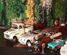
with the proper use of perspective. At left are a selection of odd scale
items that I have taken from my collection. The Corvette and the truck are
bigger than the proper 1/43 scale of the village. The Station wagon is
1/43 and the Matchbox Chevy is 1/64. In addition there is one 1/43 scale
person and two HO scale people. I'm going to use all of these items in a
single scene.
|
|
The principles of perspective are very similar to the principles
of layering (April Issue)
in that for it to work you divide the scene into the same four
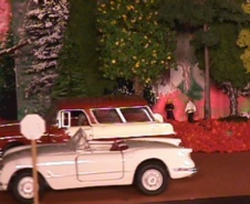
layers. Consider the pic at left; notice how the man and woman look very far away also notice how you just get a "feeling" that they are walking away from you. If you stare at it long enough you'll swear you see them moving away. At the same time look at the Corvette. It looks like a real car by comparison. The reason that the car looks real and the people look far away is because of the human brain's nearly inviolate belief in the human scale. The brain immediately accepts everything that you put in front of it that is sufficiently real to be real. It takes awhile for the other parts of the brain to analyze the image looking for the tell tale signs that it's not real. The brain is convinced that all the items in the pic are the same scale and therefore the smaller ones MUST be farther away. Your brain actually pushes this information on you....even though you know better. This illusion works because we have removed something that the brain must have in order to do a proper analysis of the depth of field. That all important missing thing is the frame of reference. Masking the frame of reference is a big part of making perspective work.
|
|
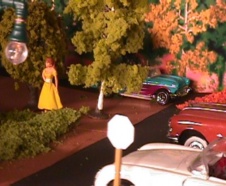
Take a look at this part of the scene. Notice how the Corvette (which
really is too big) looks fine next to the proper scale station wagon
even though the station wagon should be bigger than the 'Vette
(and not the other way around). Also notice how far away the blue
Chevy looks and how it looks like it belongs in the scene as well.
One of the best things to use to mask the frame of reference
is trees. The brain doesn't know what to make of trees since they
can be any height any width and pretty much look the same regardless
of their size. Putting lots of trees in the scene helps mask items that
are out of scale.
|
|
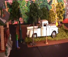
The rules for perspective are pretty simple. Just don't mix
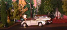
scales in the same layer. Notice in this pic how the HO scale
people on the far right and the blue chevy in the center are
in the same layer ( layer 4 to be precise). And how they
look like they belong in the scene and that they look they
are very far away. (Click on the pic to see a bigger version).
|
|
Another useful tool to help keep this illusion working is
to split equal scales. In other words to place items
of the SAME scale in different layers. Of course that's hardly
a revelation we've been doing that all along so why not here?
The better question might be why would we want to?
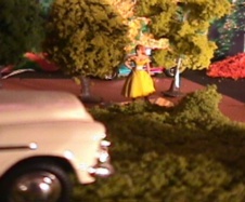
Take a look at the pic on the left. (click on it to see a larger
version) notice the woman in the foreground in the blue jeans
and the one farther away in the yellow dress. Guess what, they
are the same scale. The woman in the yellow dress appears
smaller this time because she really IS farther away. The
reason this is important is because throwing in a little
reality make it even harder for the brain to see through
the illusion since it removes another frame of reference.
Notice also that the woman is still in FRONT of the blue
Chevy (she's actually standing in Layer 3). If she was too
far back the brain could make a comparison between her
and the car and see instantly the difference in scale.
|
|
This pic gives you a better view of the area of layer 3 where
the woman in yellow is standing. Notice how the trees help
heighten the realism of the car behind her by obscuring
part of it. (click to see larger version)
|
|
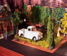
This final pix shows one more shot of the house, the truck and
the two women. You can see how they are really arranged in relation
to the other items in the scene. The truck is about the same scale
as the Corvette so it's parked in the same layer. The house is arranged
to the very front of the scene (Layer 1 the Foreground) to make it look
larger relative to everything else. Remember that the truck and the Corvette
are scaled up from the house and if they were in the same layer the house would
look too small. Likewise the house can't be located any further back because
it would give away the smaller scales that are located at the back of the scene. Well that should be all you need to know about perspective. Now you can create a scene that uses those odd sized items that you don't know what to do with.
(Note: I didn't include them here but you can do the same thing with over sized
ceramic people. Place them at the front of the scene so that they look bigger.
If you are going to go down scale to HO or 1-6x size like I did you will need
a shelf or table that's pretty deep. If your shelf or table isn't that deep
and you stil want to use large people I would recommend that you stop at 1/43
scale ( or "O" scale) and place them in Layer 4.) I'm done, it's time
for you keep your perspective and get to it!
If you have any questions about this article drop me a line at [email protected] or
|


 © 2000